Improving the DEGIRO ordering experience
Buying or selling on DEGIRO happens in the order panel — one of the most visited parts of the platform, and one users experienced as a hurdle rather than an enabler. A simplified look at how we redesigned it.
Why this project
Customer feedback kept pointing at the product ordering experience. We believed we could increase how many new clients place their first order within three months by improving the order panel — the side panel (full screen on mobile) where users specify an order and review it before sending it off.
User research
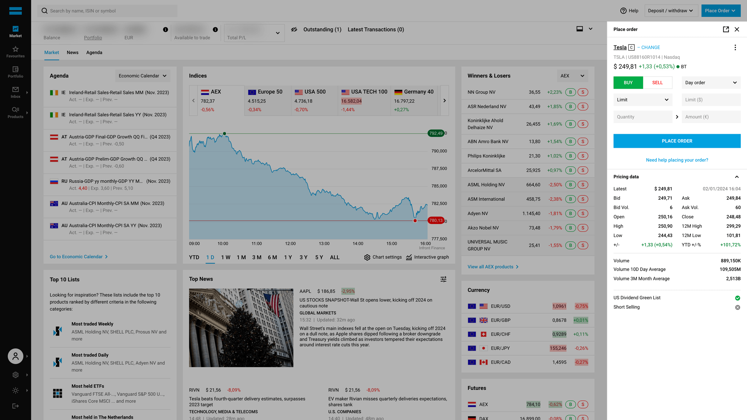
First, we scanned customer feedback from the service desk to gauge sentiment: the order panel was seen as a hurdle, not an enabler. Beginners were confused by all the options and needed more explanation of input fields and order types, and users across the board didn't trust the experience — they hit uncertainty and errors, and blamed themselves for it.
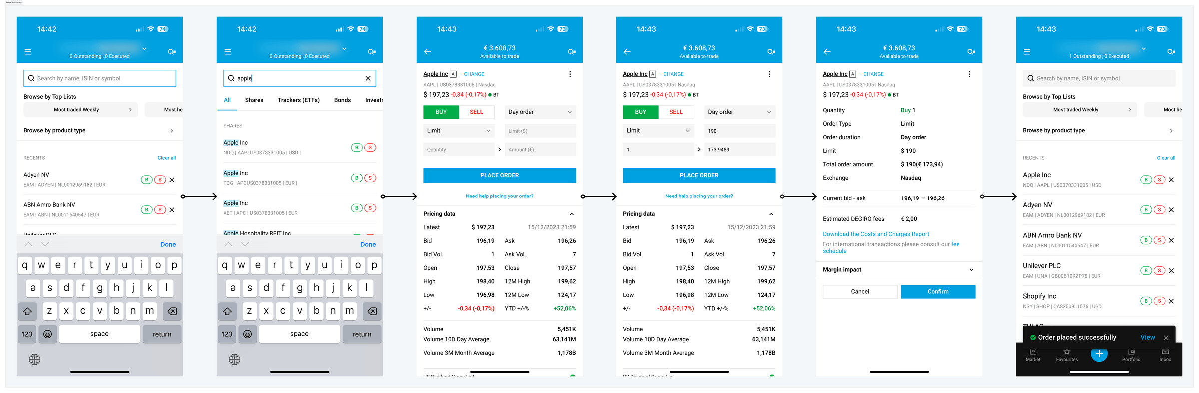
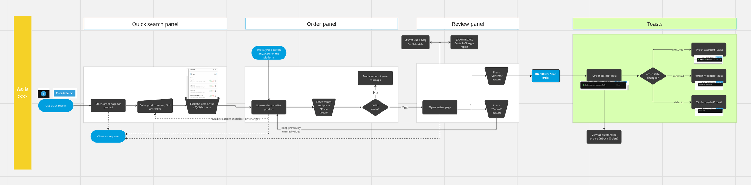
Second, we gathered known and assumed problems by asking our brokerage and IT departments how things work and should work — understanding the intended logic, and picking up ideas from people way smarter than us. Mapping the as-is user flow highlighted potential issues.
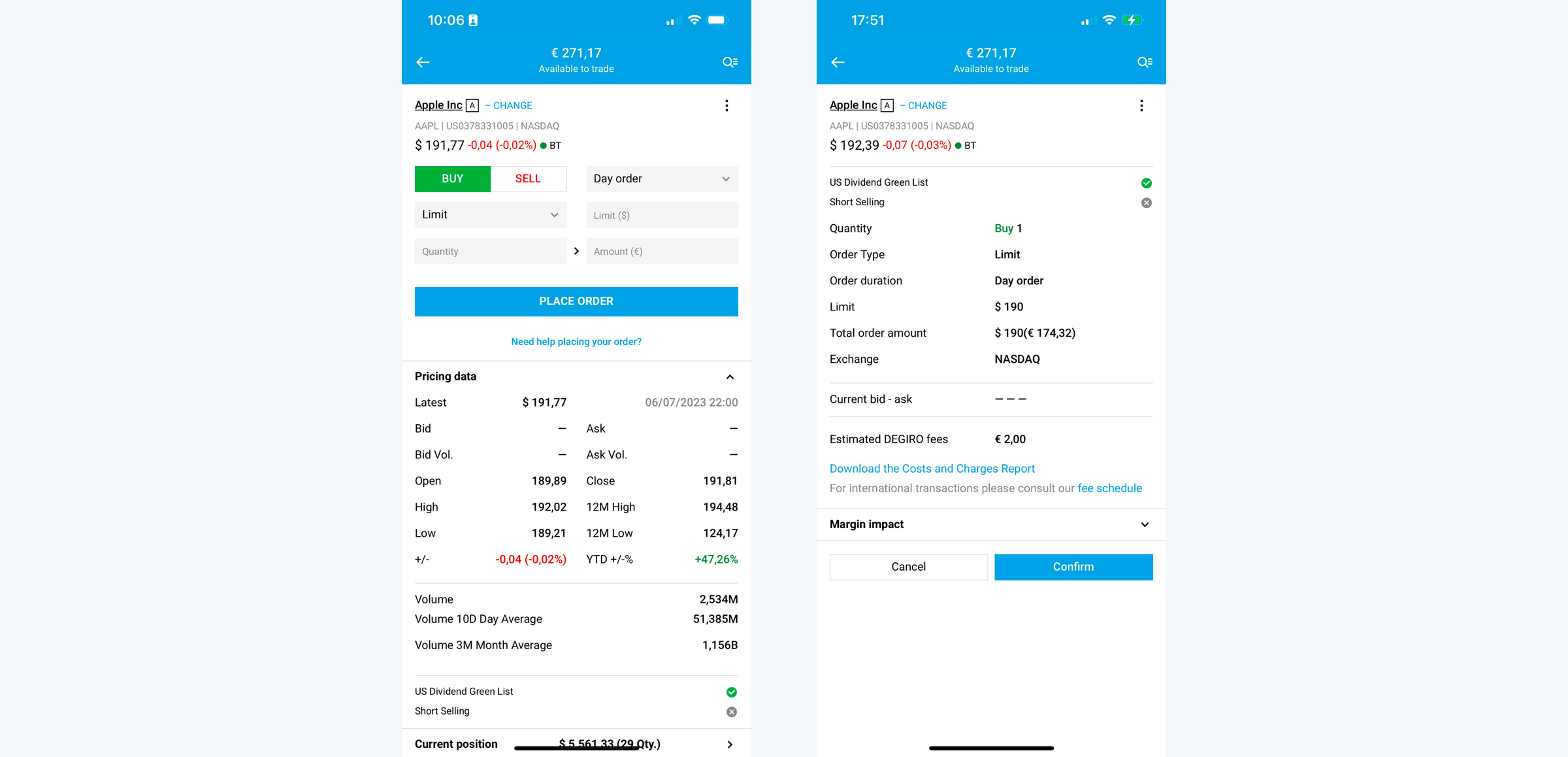
Finally, I combined this knowledge into tasks for a usability test and questions for follow-up interviews, which gave us a solid list of user problems to act on:
- Users need more explanation of input fields and order types.
- Labels disappear when entering information, confusing users further.
- Buying the same product on a different exchange means quitting the flow, searching again, and re-typing everything.
- The "place order" button intimidates — users think it instantly places the order, when it actually leads to review.
- The review panel is cluttered, and "cancel" throws users all the way back to search.
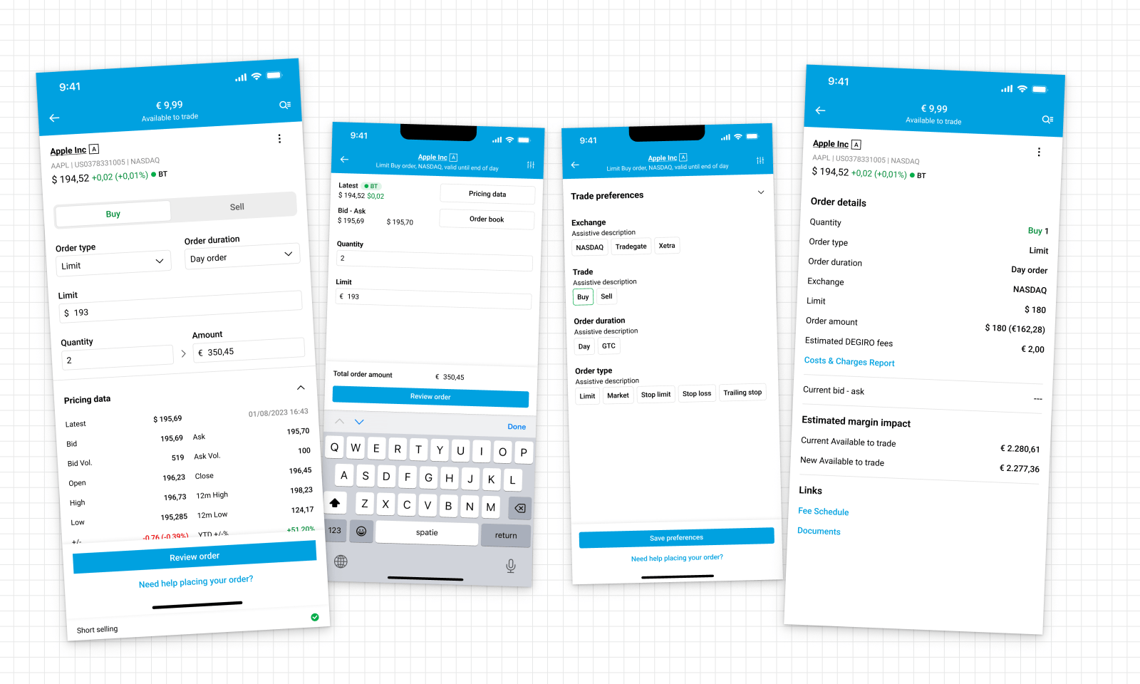
The result
Before landing on the end result we ran stakeholder interviews, impact–effort estimations, and a lot of hallway testing. Not every problem fit the scope, but the improvements were substantial:
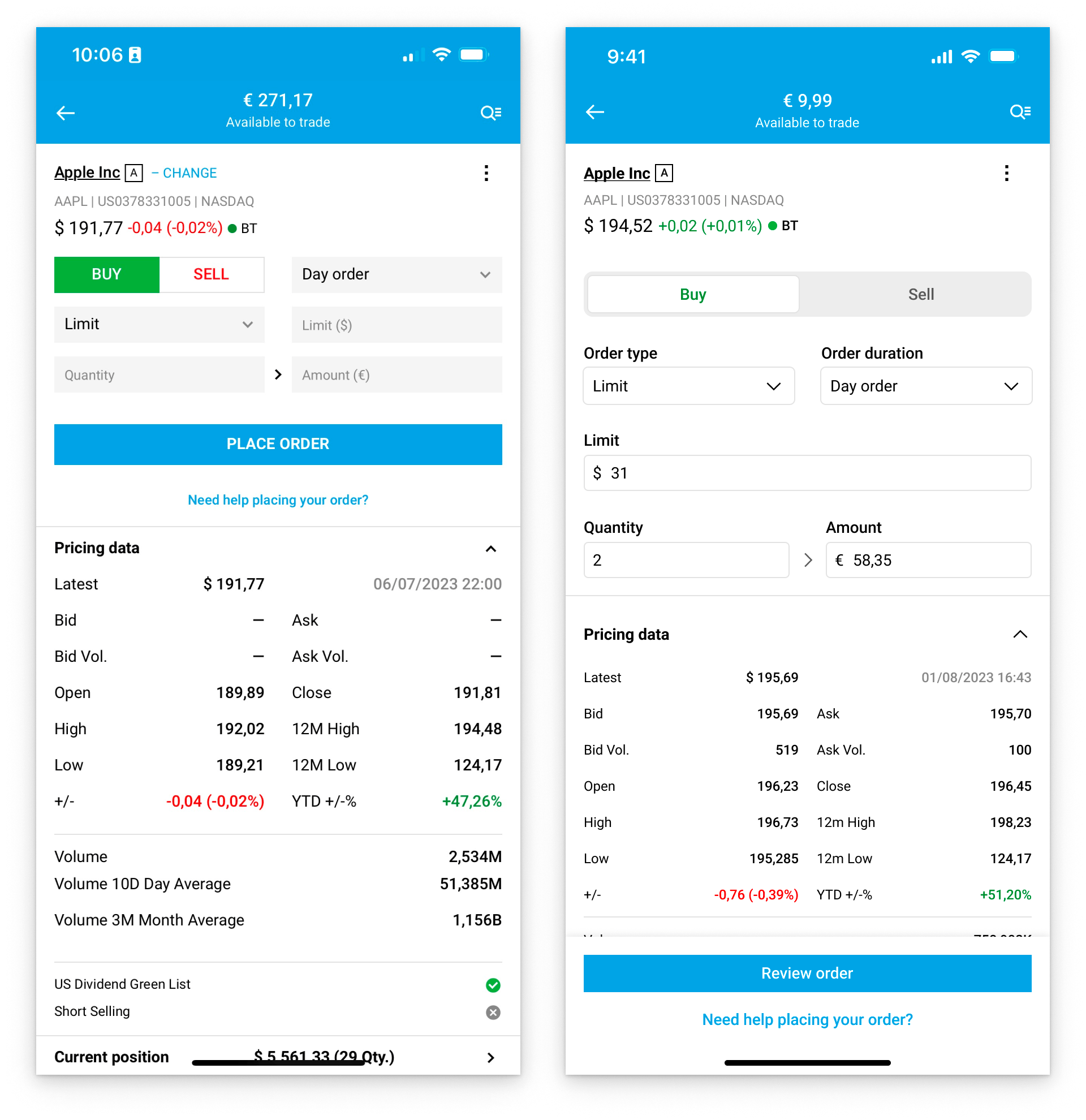
- Labels sit above the fields instead of inside them, so they never disappear. Errors are clearly worded, in red, below the field. An improved layout lets users focus on one thing at a time.
- Actions are sticky at the bottom of every page, for clarity and consistency.
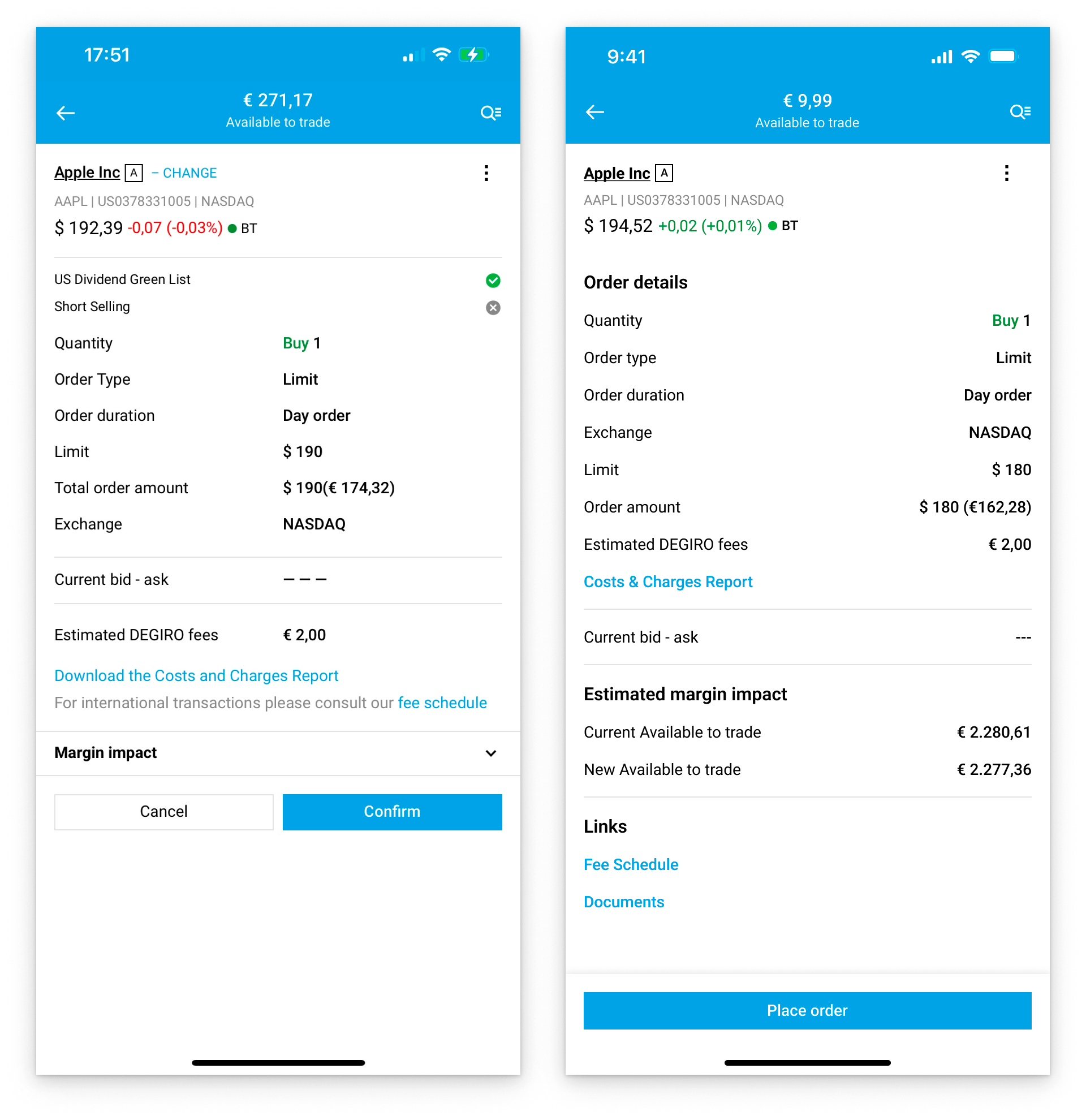
- "Place order" became "review order" — the copy now says what actually happens next. "Place order" lives on the review panel, where it belongs.
- Navigation is fixed: the redundant "change" button is gone, and the back arrow behaves consistently across devices.
- Search remembers your last input, and the order panel remembers yours when you return from review.
- The review panel got a hierarchy cleanup: order details grouped, margin data always visible for margin-loan users, secondary links in their own section.
The other ideas
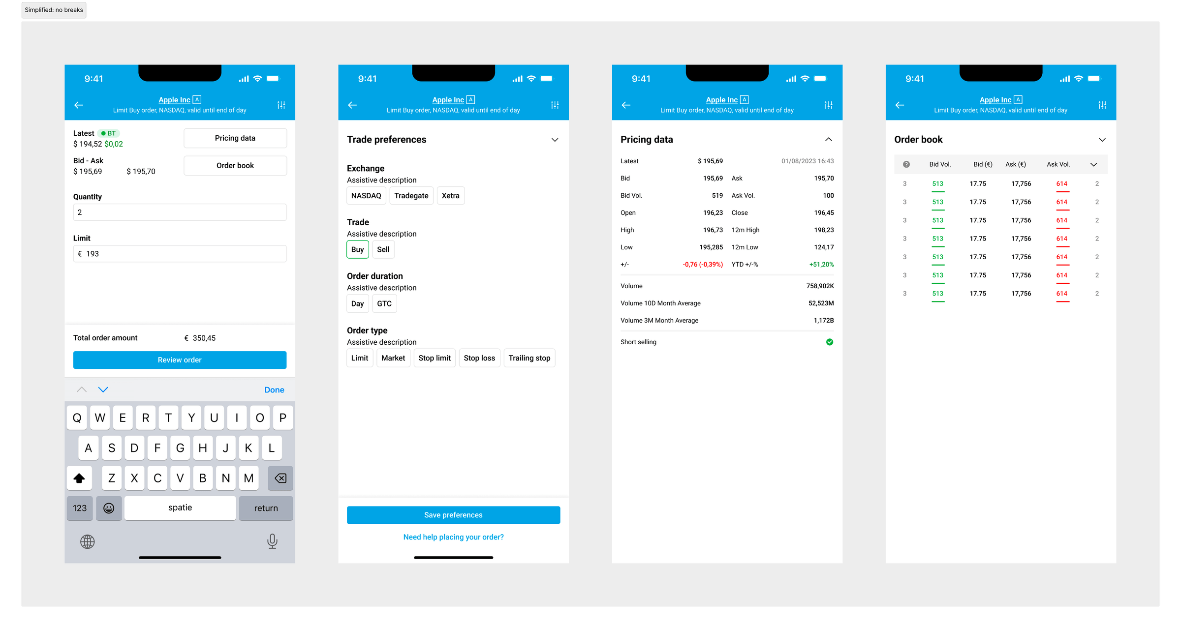
The "ultra-simplified order panel" gathered feedback on the craziest ideas — and taught me, via stakeholders, about an incredible number of restrictions I hadn't considered. It moved preferences to a separate page so users could order without distraction, but hid the live pricing and order-book data experienced users trade on.
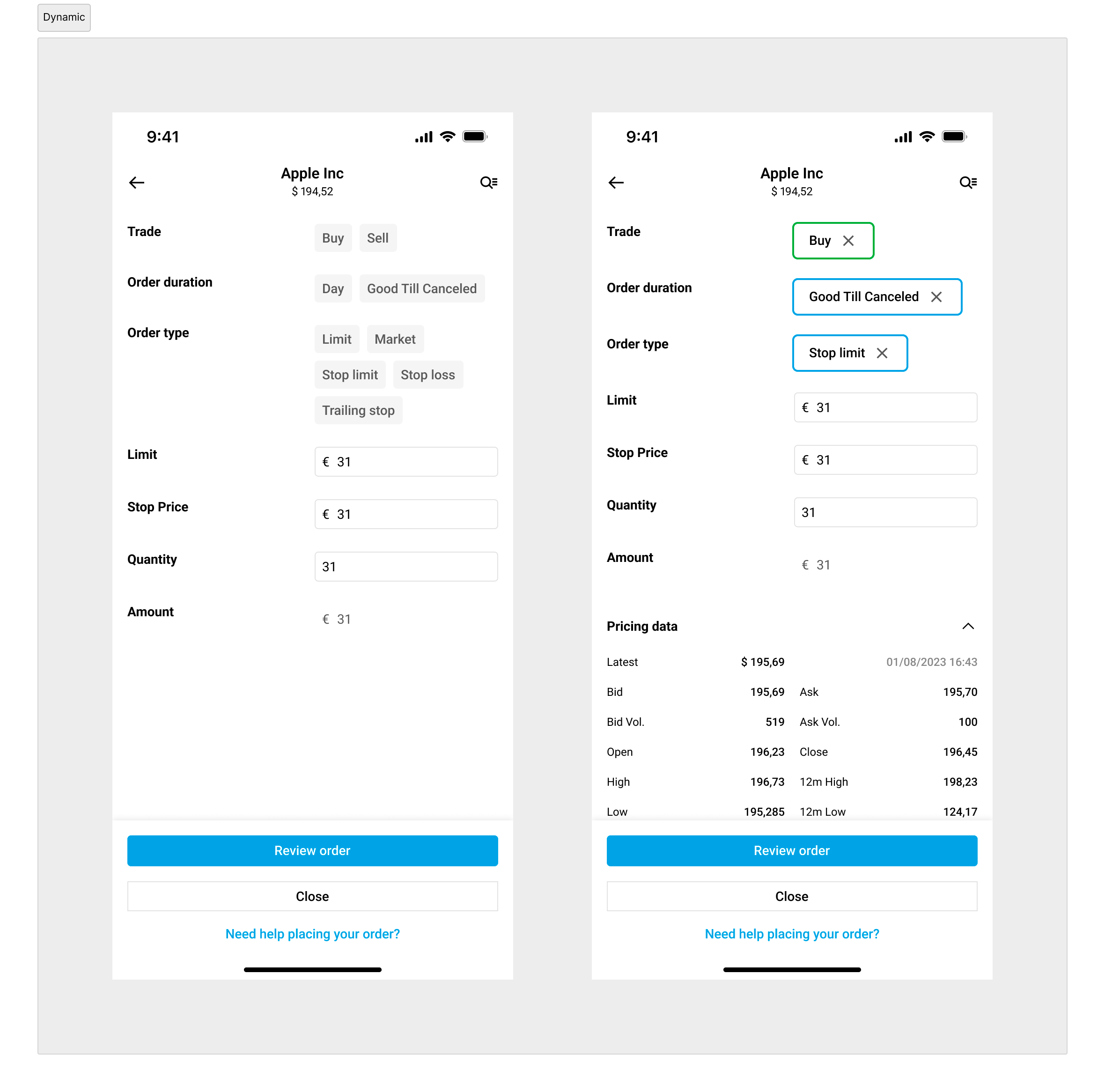
A more dynamic approach expected a preferences area to be filled out before continuing, remembered for next time so repeat trades get quicker.
How we measure success
Defined together with the Product Manager; the redesign hadn't launched yet when this was written, so results are still to come.
| Type | Metric |
|---|---|
| Quantitative | Successful orders for newly registered users |
| Quantitative | Successful orders for inexperienced users |
| Quantitative | New and inexperienced users completing their first order |
| Quantitative | Time spent placing trades |
| Qualitative | Trade confidence, via surveys and customer feedback |
| Qualitative | Volume of customer calls and complaints |